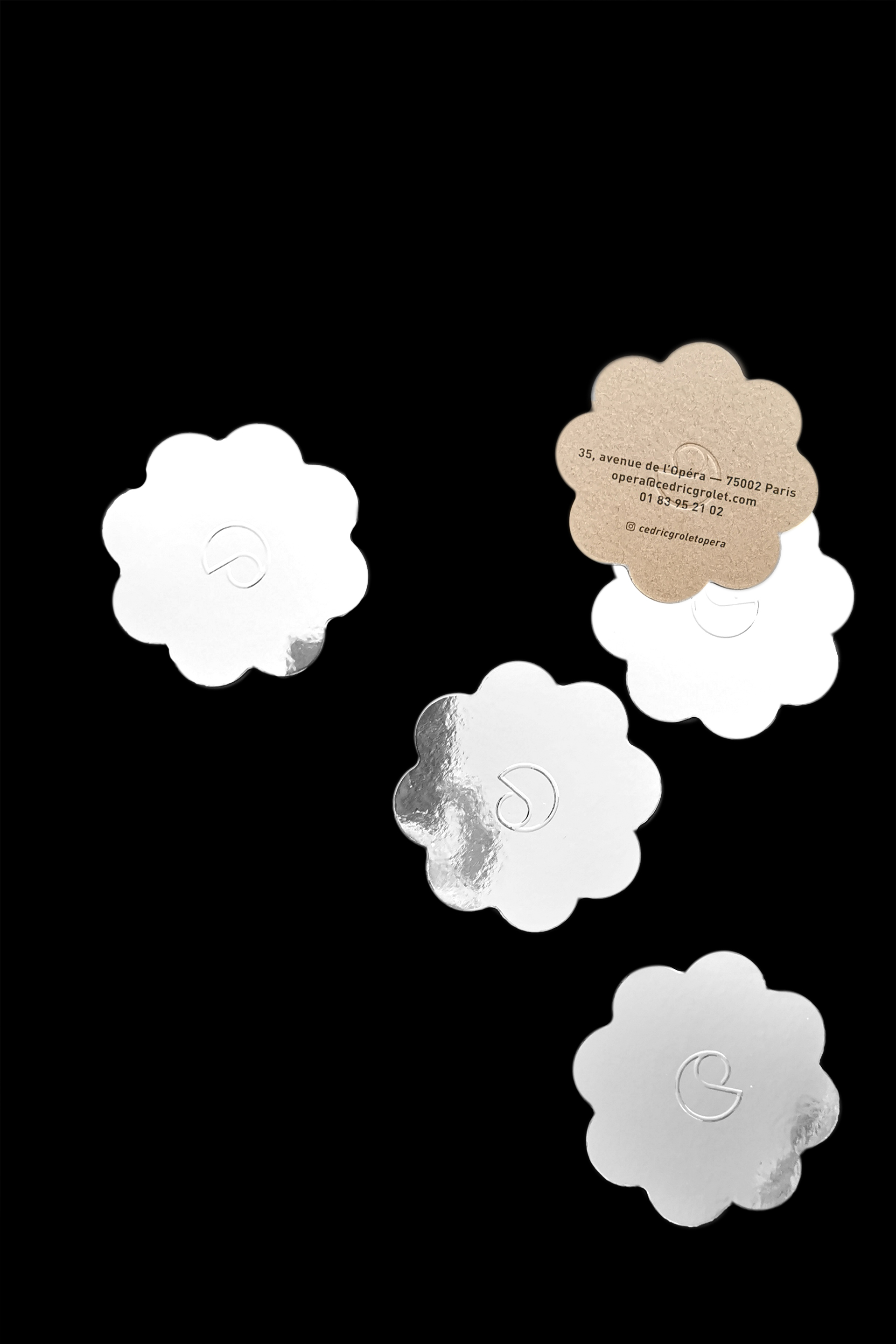
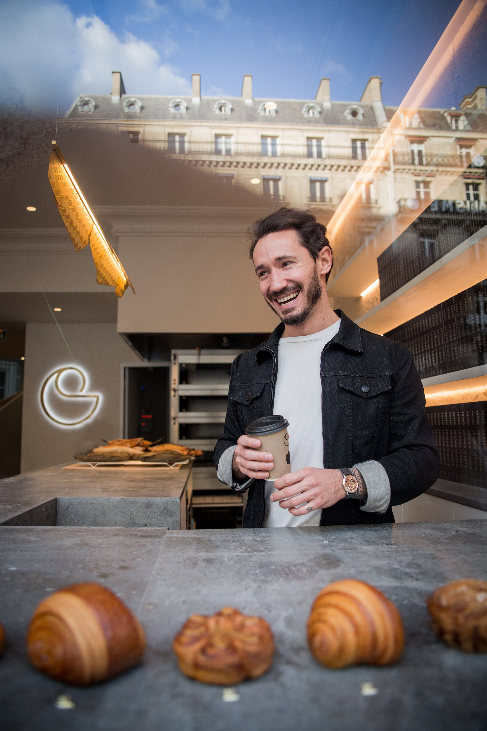
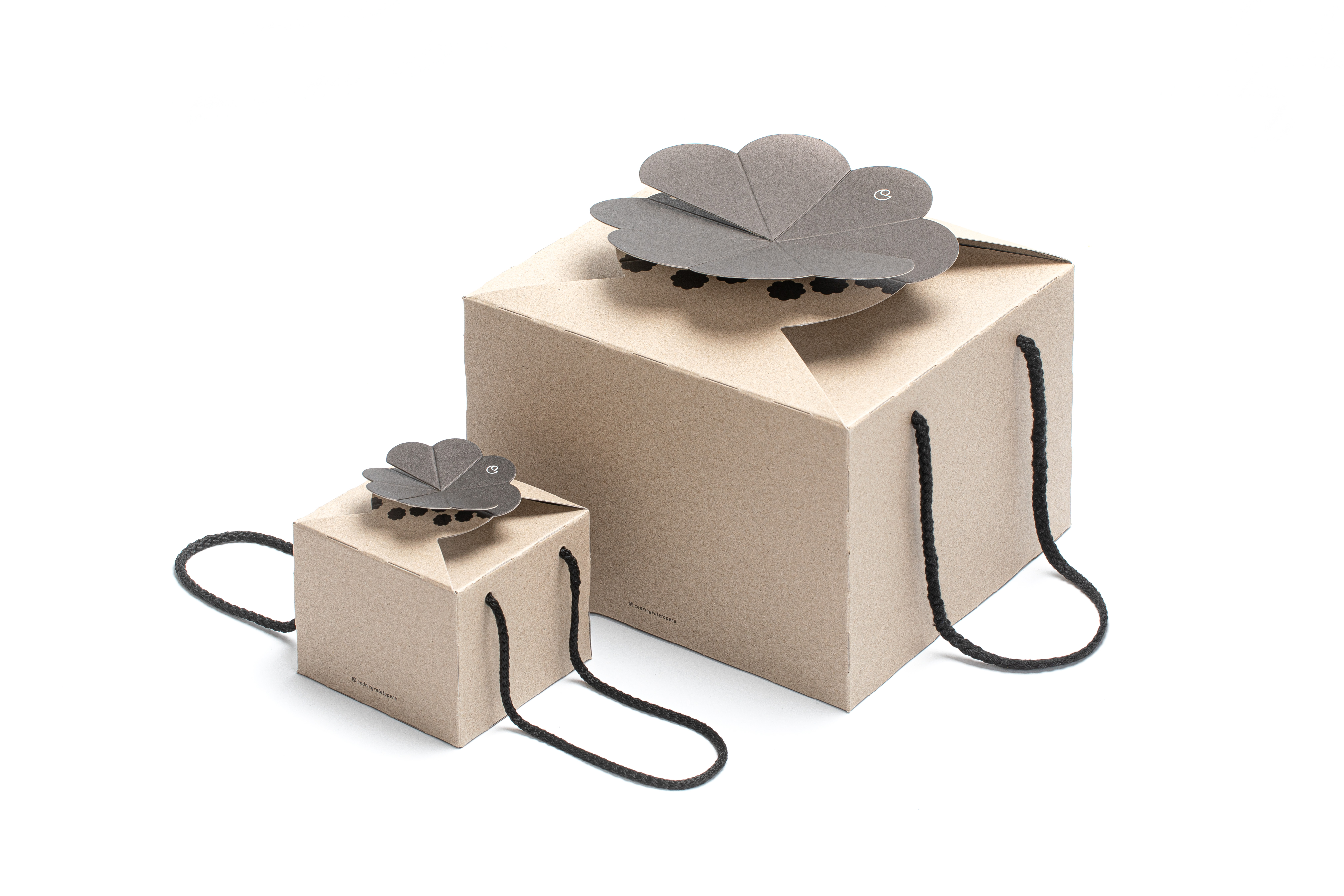
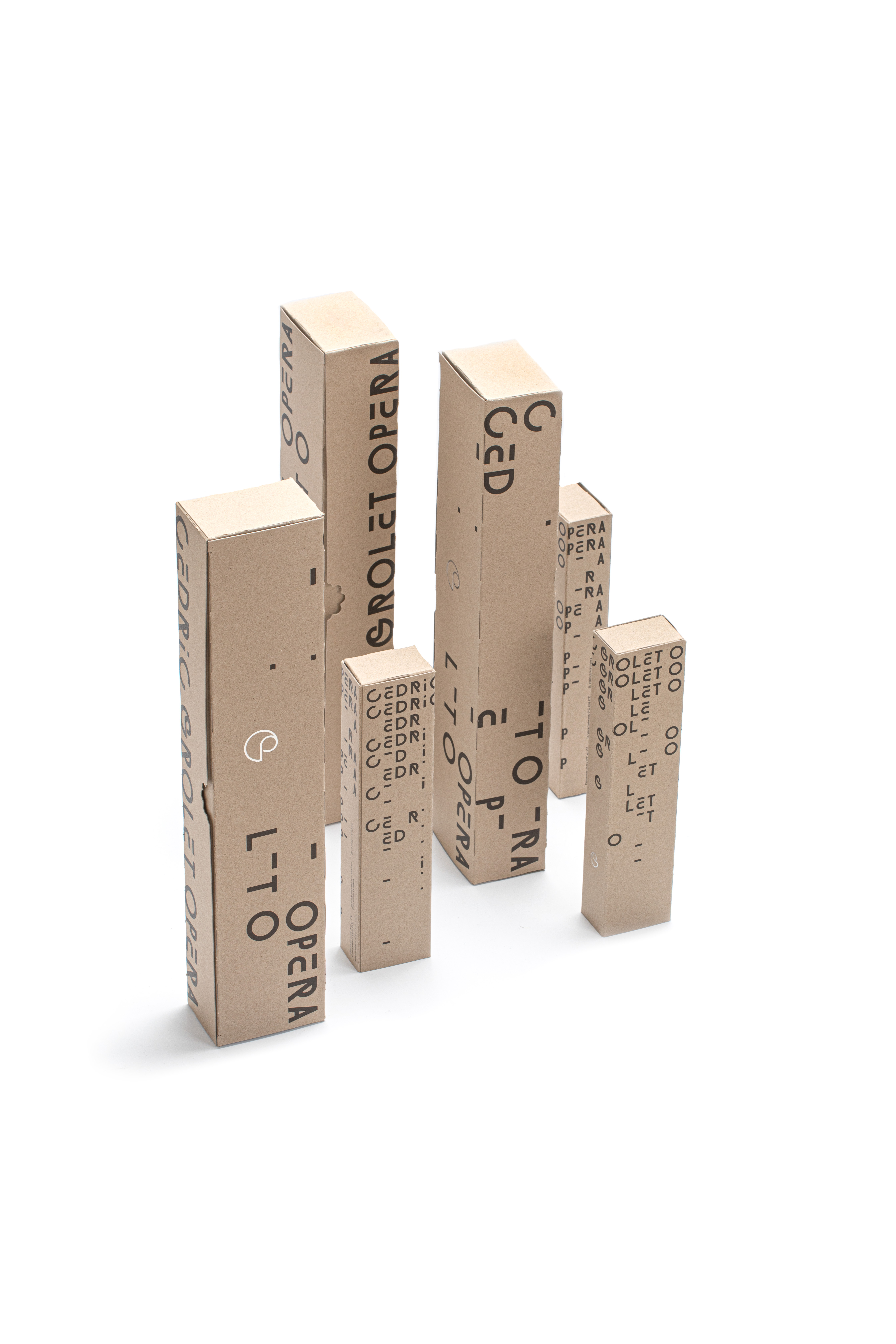
Branding and packaging for new Cedric Grolet’s pastry bakery store - Cedric Grolet Opera. The original statement of the bakery was to cut the day in sequences in order to offer ultra fresh products. We started to think about the clock to illustrate the process, and from one thing to another, the clock turned out to be a flower, continuing the story of the chef’s famous “fruits”. The sign became a real signature of the place, even to shape breads & pastries.
Cedric Grolet Opera
Branding, Packaging
2019
Photos: Pierre Monetta, Philippe Vaures Santamaria
︎ Studio: Soins Graphiques
Branding, Packaging
2019
Photos: Pierre Monetta, Philippe Vaures Santamaria
︎ Studio: Soins Graphiques


